

Imagine this, you are on your way to work – you might be in your car, riding a bike, or walking down the street… when something catches your eye! And just like that, you’re hungry. You realized you left the house and forgot to eat breakfast! What triggered this thought? A billboard for a new restaurant that just opened, a company logo hanging from the side of a building, or just the grumble in your stomach? What was it that influenced your perception, thoughts, and feelings?
75-90% of our feelings about a product are determined by the color.
So how can we use this knowledge to benefit your company brand? What colors mean what? What do you want your brand colors to say about you? Let’s break it down.
What is color? Color is… “the aspect of the appearance of objects and light sources that may be described in terms of hue, lightness, and saturation for objects and hue, brightness, and saturation for light sources.” – Merriam Webster
Color Theory
What is color theory? Color theory is a set of rules and guidelines that help communicate with an audience. When you understand these rules and guidelines you can use this knowledge to alter the human mind and perception. It can be broken down into four parts – color groups – color value – color tone – and color formulas/schemes.
1. Color Groups:
Back in the 17th century a man that went by the name of Sir Isaac Newton (you might have heard of him) discovered the spectrum of light, and through his research, he developed the first ever color wheel.
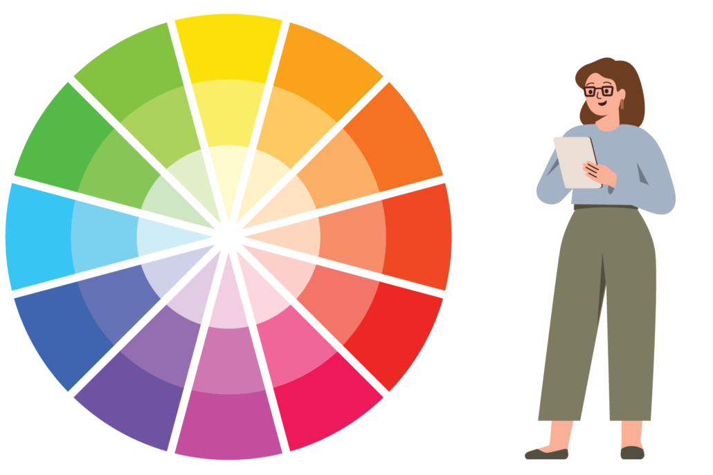
The color wheel shows an interpretation of color. It provides a tool that we can use to define color relationships and bring balance and harmony to design.
These colors can be split into three groups:
1. Primary (red, blue, yellow)
2. Secondary (mixes of primary colors)
3. Tertiary (or intermediate – mixes of primary and secondary colors)
Knowing these groups and referencing the color wheel is a helpful place to start when bringing color into designs.
2. Color Value:
Color value is when you take a primary, secondary, or tertiary color and make it brighter or darker.
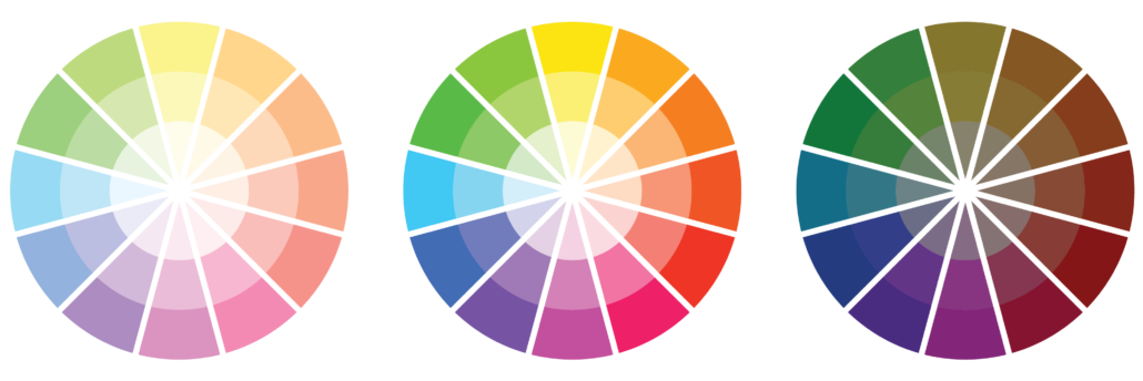
Adjusting the value of a color can bring depth, contrast, and balance to a design.
Check out this tool to find new color hues >>>
3. Color Tone:
So what do all these colors mean? Let’s talk about the emotion and feeling that each color can compose. (Please note, these are common psychological effects of color in the United States, various cultures’ perceptions on color can be vastly different.)

Shades:
- White – Purity / Sense of Space / Balance
- Black – Powerful / Edgy / Sleek
- Gray – Neutral / Timeless / Practical
Colors:
- Red – Romance / Intensity / Energy
- Orange – Happy / Warmth / Enthusiasm
- Yellow – Cheerful / Optimism / Friendliness
- Green – Fresh / Growth / Harmony
- Blue – Calm / Security / Confidence
- Purple – Regal / Prosperity / Sophistication
- Brown – Stability / Comfort / Organic
- Pink – Love / Gentle / Fun
Tip: If you are struggling with deciding what your color brand needs to be, think about how you want your audience to feel when they are looking at your brand. Pick a color that correlates with that feeling and builds upon that response.
4. Color Formulas/Schemes:
Referencing the color wheel, color guidelines, and color tone we can start to build a color scheme by using the formulas below:
1. Monochromatic – the use of one color, adjusting the hue to create color variations.
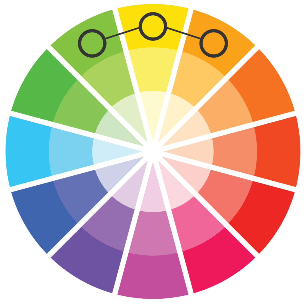
2. Analogous – the use of three colors that are next to each other on the color wheel.
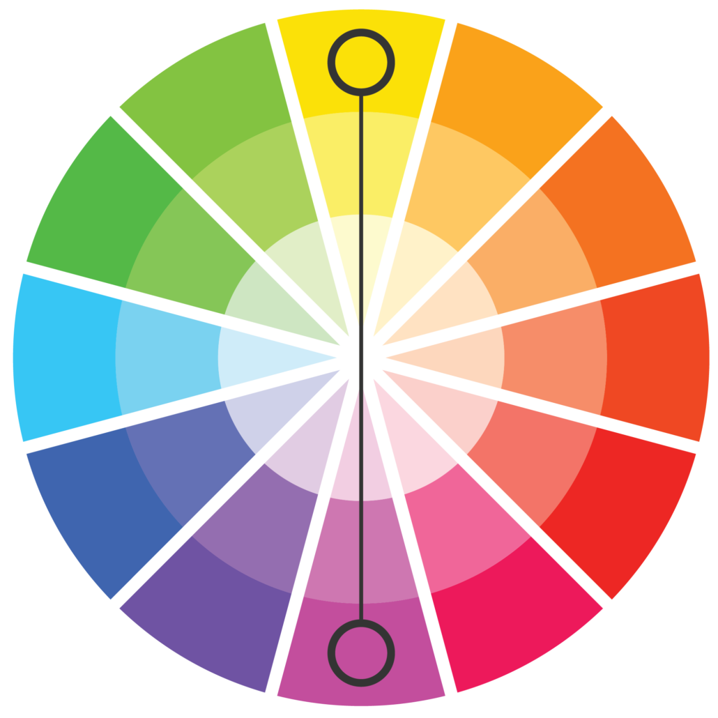
3. Complementary – the use of colors that are direct across from each other on the color wheel, creating strong contrast.
4. Split Complementary – the use of three colors, pick one color, then take its complementary color and use the two colors that are on either side of the complementary color.

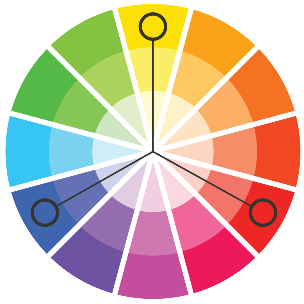
5. Triadic – the use of three colors evenly spaced on the color wheel.
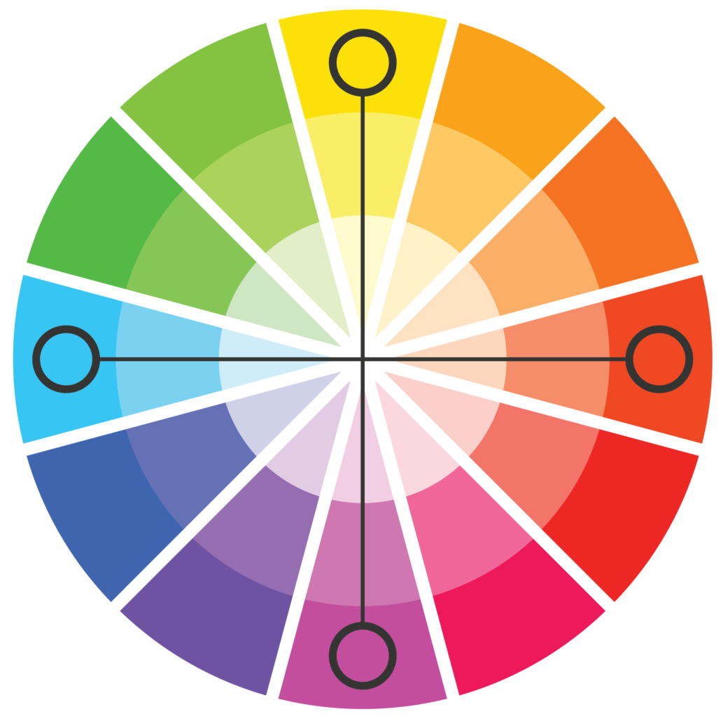
6. Tetradic – the use of four colors, or the combination of two sets of complementary colors.
Tips + Tricks to Color
1. Be consistent. Once you find the colors you want to use for your brand, stick with them! Colors are a key factor of a brand, they give you recognition. Think about the colors that come to mind when thinking of McDonald’s, Starbucks, Facebook, and so on. They have defined colors that help with their brand recognition and convey their authority.
2. White space is good! White space is not a waste of space on your website, in fact it plays a very important role on your screen. It allows for breathing room, space for the eye to rest, and room to visually collect information that is being provided. But the key is balance. Too much white space and your site could look like it is lacking, and not enough and it could hurt your visual voice.
3. Think about your audience. Who are the people you are selling your service or product to? Do they have the same perception of color as you do? Take the time to understand why different people, cities, and countries have different perspectives on color and align that perception with your brand.
4. Think about how you want your audience to feel. Once you know how you want your audience to feel when they are using your services or product you can look at the general emotion that is tied to each color.